Nullshift — Agentic AI automation · Design system 2026
The single source of truth for Nullshift's visual identity: the cream-and-dark themes, one emerald accent, square geometry, TASA Orbiter and Roboto Mono, and the agentic node-network that signs every surface.
// 01 — Typography
Type system
Display / Headings
TASA Orbiter
700 · UPPERCASE var(--font-sans)
Every heading — UPPERCASE, weight 700, -0.03em tracking, ~1.04 line-height. The voice of the brand.
Eyebrows, tags, numbers, system markers — UPPERCASE, 0.1em tracking. Never on headings.
// 02 — Colour
Cream, dark & emerald
Ink
#0a0a0a
Dark theme
Bone
#f4f4e8
Dark theme
Surface
#141414
Dark theme
Muted
#9a9a90
Dark theme
Cream
#f4f4e8
Cream theme
Ink on cream
#0a0a0a
Cream theme
Surface
#ecece0
Cream theme
Muted
#55554c
Cream theme
Emerald
#10b981
Brand
Emerald bright
#34d399
Brand
On emerald
#04140d
Brand
Success
#2BE08C
Signal
Warning
#F5D547
Signal
Danger
#FF3A5C
Signal
// 03 — Logo & mark
The mark
Primary lockup
NULLSHIFT
Mark
App icon
// 04 — Visual language
The node-network
The signature motif: nodes wired together with emerald data-pulses routing the edges — intelligence, connection and work routed end to end. It runs live behind every dark hero and resolves to this static mark in print. Pair it with square, hairline geometry and a single emerald highlight.
// 05 — Principles
Core principles
01
Cream & dark, in rhythm
The site alternates warm cream and near-black, section to section. Two themes, one system — the warm off-white that's text on dark becomes the canvas on cream.
02
One emerald, used sparingly
Emerald #10b981 is the only colour — one highlighted word per headline, CTAs, focus, the logo pill. Signal colours (success, warning, danger) are status only, never decoration.
03
Square, hairline, uppercase
Corners are square — radius 0, only true circles round. 1px hairline borders draw the geometry. TASA Orbiter sets UPPERCASE headings; Roboto Mono sets the labels.
04
Systems you can see
The agentic node-network — nodes wired together, data pulses routing the edges — is the signature motif: intelligence, connection, and work routed end to end.
The single source of truth for Nullshift's identity — the cream-and-dark themes, the one emerald, the square geometry, TASA Orbiter and Roboto Mono, and the agentic node-network that signs every surface.
Two typefaces carry the whole system. TASA Orbiter sets every heading in UPPERCASE and the body in sentence case; Roboto Mono handles the labels, tags and numbers.
TASA Orbiter · 700
Automated by AI you own.
Display / Headings
TASA Orbiter
700 · UPPERCASE
var(--font-sans)
Every heading — UPPERCASE, weight 700, -0.03em tracking, ~1.04 line-height. The voice of the brand.
Eyebrows, tags, numbers, system markers — UPPERCASE, 0.1em tracking. Never on headings.
[02]Colour
Cream, dark & one emerald
The marketing site alternates two themes band to band. Emerald is the only accent — everything else is the warm ink-and-bone range. Signal colours are status only.
Dark theme
Cream theme
Brand
Signal
[03]Logo & mark
The mark
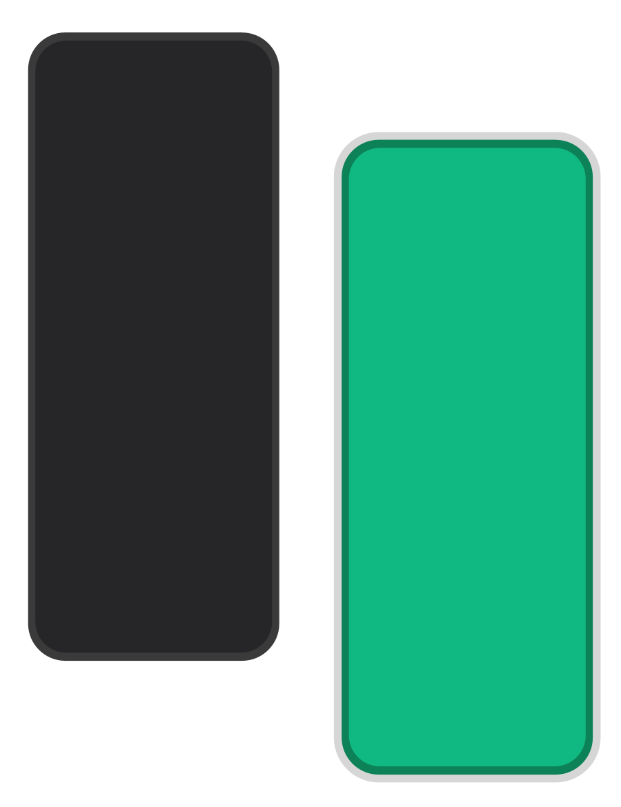
Two staggered rounded pills — one bone, one emerald, offset to suggest a shift — beside the NULLSHIFT wordmark. The pills are the one place curves are allowed; everything around them is square.
Primary lockup
NULLSHIFT
Mark
App icon
Do
▸Keep clear space of at least the mark's width on all sides
▸Minimum lockup width 120px · minimum mark 18px
▸Show the lockup on dark, or use the light-background asset
▸Keep the bone pill / emerald pill relationship intact
Don't
✕Don't rotate, stretch or distort the mark or pills
✕Don't recolour the pills or change the scheme
✕Don't round the corners of containers — stay square
✕Don't place the dark lockup on busy or light backgrounds
✕Don't recreate or re-letter the wordmark
[04]Visual language
The agentic node-network
The signature motif across every dark surface: nodes wired together with emerald data-pulses routing the edges — intelligence, connection, and work routed end to end.
Live · NeuralField
A hand-written canvas backdrop. Single context, paused off-screen, one static frame under reduced-motion.
Static mark — for print & favicons
[05]Principles
Core principles
01
Cream & dark, in rhythm
The site alternates warm cream and near-black, section to section. Two themes, one system — the warm off-white that's text on dark becomes the canvas on cream.
02
One emerald, used sparingly
Emerald #10b981 is the only colour — one highlighted word per headline, CTAs, focus, the logo pill. Signal colours (success, warning, danger) are status only, never decoration.
03
Square, hairline, uppercase
Corners are square — radius 0, only true circles round. 1px hairline borders draw the geometry. TASA Orbiter sets UPPERCASE headings; Roboto Mono sets the labels.
04
Systems you can see
The agentic node-network — nodes wired together, data pulses routing the edges — is the signature motif: intelligence, connection, and work routed end to end.
[06]UI system
Square, hairline, themed
Every interface is built from square corners, 1px hairline borders, two surface tiers per theme, and one emerald action colour.
Buttons — square, no radius
Primary actionSecondary
▸Radius 0 — square corners everywhere
▸Roboto Mono · UPPERCASE · 0.06–0.1em tracking
▸One emerald for primary; hairline outline for secondary
▸No drop shadows, no glows, no gradients
Surface tiers — per theme
Dark · bg
Dark · surface
Cream · bg
Cream · surface
Two tiers per theme — canvas and surface. Hairline 1px borders draw the structure; depth is never faked with shadow.
Section label pattern
[0X]Section label
·[index] in emerald + label in fg
·Roboto Mono · 0.74rem · 0.1em tracking
·Always UPPERCASE, once per section
·Square emerald cursor block, not a dot
[07]Downloads
Brand assets
The full guidelines as a PDF, plus logo files and the animated intro — for slides, socials, signatures, partner sites, or anywhere the brand shows up.